Posts relating to arts projects (writing, curating, etc.)
-
The Art of Engagement

Natalia Milosz-Pieraska (image credit: Kim Brockett) Contemporary jewellers, Kristin D’Agostino and Raewyn Walsh have recently curated and installed a fantastic exhibition at Objectspace, featuring twenty nine exciting contemporary jewellery makers from around Australia and New Zealand. The exhibition is scheduled to run until 26 February 2011, at the Objectspace Window Gallery space.
The curators write: “New Zealand and Australia seem like natural allies. Both counties were colonized by the ‘motherland’, and both are geographically isolated from the self-proclaimed jewellery epicenter – Europe. Yet despite some historical exchanges, and past trans-tasman exhibitions, long lasting jewellery relations remain relegated to a series of ‘almost-rans’. Is the work incompatible? Are our cultural experiences too disparate to allow any meaningful connections?
Back in October 2010, an exhibition of work by fifteen NZ jewellers went to Sydney, Australia under the moniker Touch, Pause, Engage. This time around, the work of fourteen Australian jewellers sits alongside the New Zealand fifteen in an effort to compare and contrast current jewellery practices and to see if we are running on an even playing field.
Touch, Pause, Engage was originally intended to offer the Australian community a glimpse into the Contemporary Jewellery scene in Aotearoa, New Zealand, and to reset the trans-Tasman rivalry between our rugby-loving brothers and sisters. Known primarily as the call the referee shouts before two rugby teams lock into a scrum, Touch, Pause, Engage, re-presented at Objectspace as The Art of Engagement, has now become an invitation for artists to converse through jewellery, as well as a call to audiences to interact with the work in both its physical and conceptual manifestations.”
-
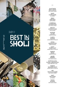
Best in Show 2011 publication
Best in Show 2011, 29 January – 24 February, now has a digital publication which you can download here from Objectspace.
Best in Show 2011 publication -
Best in Show 2011
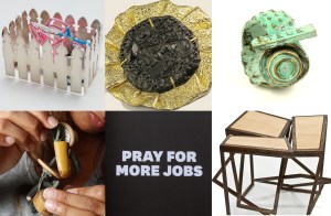
Best in Show 2011 The Best in Show exhibition series is an annual fixture in the Objectspace calendar. Inaugurated in 2005, the aim is to showcase Objectspace’s selection of talented emerging applied arts graduates from tertiary institutions around New Zealand. Areas of practice covered in 2011 by these ‘diamonds in the rough’ include graphic design, digital design, textiles, ceramics, contemporary jewellery and furniture.
These sixteen bachelor-level graduates display a consistent level of polish that belies the relatively limited amount of time spent in their respective fields. Each of the exhibitors displays either a limited edition, one-off, or specialist type of production and this often entails few compromises when it comes to construction materials, aesthetic decisions and other artistic concerns. Some of the concepts addressed include: the energy within objects; randomness; contrasts and purposes within natural materials; popular traditions; class; graffiti; commercial branding; digital communication; apocalypse; ruins; obsolescence; nurturing; growth; and the visual language of experimental music.
Best in Show 2011 features graduates from: AUT University (Te Wānanga Aronui o Tāmaki Tāmaki Makaurau), Hungry Creek Art and Craft School, Manukau School of Visual Arts (Te Whare Takiura o Manukau), Massey University (Te Kunenga ki Pūrehuroa), Unitec (Te Whare Wānanga o Wairaka), Whitireia (Te Kura Matatini o Whitireia). The exhibition will feature a major print feature in collaboration with Threaded Magazine.
What: Best In Show 2011
Where: Objectspace, 8 Ponsonby Rd, Auckland
When: Saturday 29 January – Thursday 24 February 2011.
Gallery hours: Mon – Sat, 10am – 5pm. Free admission.
-
Objective lessons: a review of the 2010 Objectspace programme
On 14 December 2010 I wrote a review of the 2010 Objectspace programme:
“It is nearly seven years since Objectspace opened its doors at 8 Ponsonby Road. In the ensuing time frame, this small non-profit presenting institution, largely funded through Creative New Zealand along with a variety of sponsors and private donors, has consistently pursued and sharpened its mandate to talk about and showcase applied arts practice in New Zealand. Presenting an ever growing core audience with frequently changing exhibitions supported by an award winning publications programme, web archive, as well as regular talks and lecture events, these experiences and perspectives are clearly reflected in the organisation’s current purpose statement: ‘To position making – principally in the fields of craft, applied arts and design – within a range of cultural, economic and social frameworks in order to provoke new assessments about the making, functioning and value of works and practices.’…
Read the rest here.
-
The Halo Effect
A 2010 work by Auckland based artist, Chris Hargreaves, Halo displaces field recordings taken at various locations and repositions these findings into a sound incorporating sculpture. Displayed at the Uxbridge Arts Centre during the Manukau Festival of the Arts, the work creates an artificial ‘ecosystem’ of sound. Simultaneously analogous to multiple locations, the semi-random juxtapositions created in Hargreave’s sculptural mash-up of sound recordings highlight the diversity of the Manukau region and complexity of the contemporary urban soundscape.
Trained both as a pianist and as a visual artist, these two areas of knowledge inform each another in his visual art practice. For instance, Hargreaves’ approach to sound as the central component in Halo shares an affinity to the theories and practices of phonology and of musique concrete. French composer Pierre Schaeffer, founder of musique concrete in the mid-twentieth century, pioneered the usage of what he called acousmatics (sound one hears without seeing the originating source) in playful creative practice. The interesting juxtapositions of phonographic sounds in Halo suggest the hand of the artist is at play with our surroundings and that he is inviting us to engage too, at an experiential level. After all, we each have many thoughts and feelings relating to the innumerable sounds we are constantly experiencing.
Hargreaves notes that he is interested “in the way the interpretation of the familiar object can be changed when it is re-contextualised, in notions of truth and nostalgia, in the way people interact and build relationships with material objects, and how this can alter what we perceive to be real or genuine.” Given this observation by the artist himself, it is fitting that the physical construction of Hargreaves Halo and the sound it incorporates offers the viewer a number of ways in which to perceive the artwork. For instance, some viewers may see a metaphorical wink to Uxbridge’s previous history as a community church. For others, Halo may suggest a metaphor similar to the incredibly popular computer game of the same name, which involves an alien race occupying an artificial planet resembling a ‘halo’ with its living ecosystem spread over an earth-like landscape inside the rim of this unique shaped biosphere.
Involving the audience as both viewers and listeners, Halo invites the audience to interrogate individual perceptions around our sense of place through sound. This approach is partially inspired by key works from the conceptual artists, Bruce Nauman and Bruce Barber. These artists employed a binary approach to sound in their respective art practices. In one well known Nauman video work, Hargreaves was drawn to the interplay between two clowns talking at the same time, one saying ‘yes’ repeatedly and the other saying ‘no’. Similarly, in a challenging Barber video, Hargreaves recalls “a couple continually scream at each other”. Both of these seminal works deliberately pit the voices of actors against one another, revealing universal truths about human nature. Hargreaves Halo also operates in this vein; not attempting to tell you what to think, but juxtaposing multiple urban noises against one another in a simple yet conceptually rich gesture.
Matt Blomeley, 29 September 2010 (writing commissioned by Chris Hargreaves for the Manukau Festival of Arts)
-
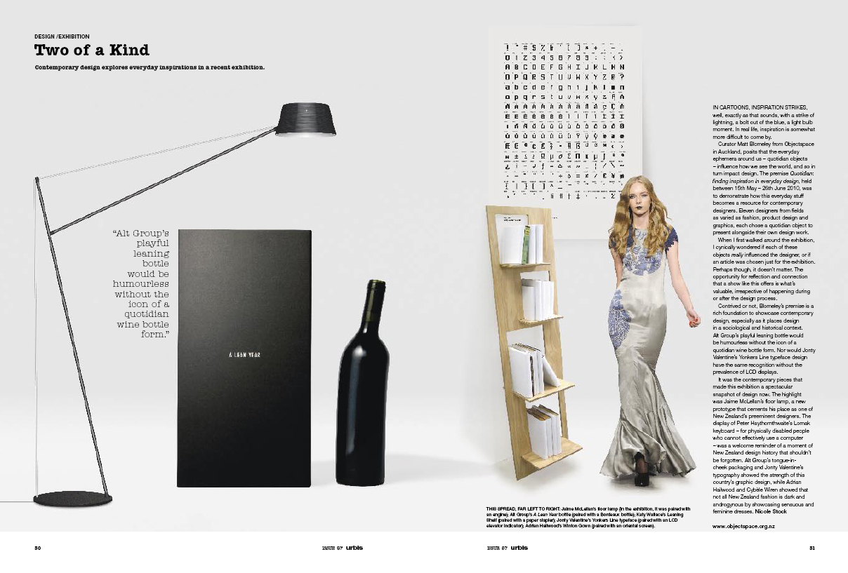
Quotidian featured in Urbis
-
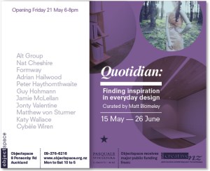
Quotidian: finding inspiration in everyday design
Publication essay for Quotidian: finding inspiration in everyday design, curated by Matt Blomeley, showing at Objectspace until 26 June 2010.

Quotidian installation at Objectspace The Quotidian
“the human mind is exquisitely tailored to make sense of the world. Give it the slightest cue and off it goes, providing explanation, rationalization, understanding. Consider the objects–books, radios, kitchen appliances, office appliances, office machines, and light switches–that make up our everyday lives. Well-designed objects are easy to interpret and understand. They contain visible clues to their operation.” Donald A. Norman[1]
Quotidian: finding inspiration in everyday design offers a selection of New Zealand designers who talk about existing objects of design that have inspired their practice. These nine individuals and two collectives have each chosen a quotidian (def: everyday, commonplace) object not conceived by them which in some sense is a design inspiration, partnered it with an object of their own design and then written about the relationship between the two. The result is a collection of unique discussions that provide a designers eye view of our varied and complex relationships to objects that surround us.
The eleven everyday objects chosen evidence an impressive variety of influences upon the objects produced by these designers with which they are partnered. Through these qualities identified as influences it becomes apparent that what we call ‘original’ is often inspired by, or negotiated, through our appreciation of the everyday. Significant qualities highlighted by these designers and discussed in this exhibition project include; categorical references, aesthetics, mechanical principles, universal design, balance, precision, systems, economy, ecology, sensuality, purposefulness, freedom, beauty, history, skill, craft, and the decorative arts.
Matthew von Sturmer compares his design process to an axe. Using this ubiquitous and age old object to explain a simple mechanical principle, which is a driving force in his design process, “work equals force multiplied by distance.” Drawing upon this idea and another principle inherent in the design of the axe; the taper, it is apparent that modern digital tooling has fundamentally altered von Sturmer’s approach to his practice. Prototyping objects with a digital workflow in his studio and using ‘Trimatrix’, a “friendly” product developed as an alternative to more toxic materials such as MDF, von Sturmer observes that it is not the technology or the possibility of a smaller carbon footprint that drives him.[2] Through his renewed consideration of the engineering properties of an axe, von Sturmer has discovered new understandings, and perhaps new possibilities, in prototyping and manufacturing, as the Taper bench seat he presents in this exhibition bears witness.
In 2009 product designer Jamie McLellan wrote, “over the years I have learned to live with and celebrate my inner engineer”[3]. McLellan draws a significant amount of inspiration from the forms within industrially produced objects. What could in some sense be referred to as a form of ‘interior design’ is upon closer inspection a process involving direct formal and philosophical influences that draw upon the technology, processes and materials often unseen within the everyday, to inform the new products he designs. McLellan’s prototype carbon fibre Floor Lamp presented in Quotidian is expressive of this aim, “my fascination with engineered objects has led to many of my designs being expressive of their ‘insides’, with nothing hidden and no sides that shouldn’t be seen.” Peter Haythornthwaite, a well known New Zealand designer with a great deal of experience and a particular interest in manufactured objects, similarly finds “beauty in honesty.” Haythornthwaite, in his discussion of a design classic, the Olivetti Lettera 22, suggests that this complex and well developed object wasn’t indulgent, but exceptional, and what made it so was that the Lettera 22 “was not a product of styling imagination but rather of form determined by purposefulness – and that’s where its beauty originates.” Relating this modern classic to a principle of design such as purposefulness seems all the more important when considering the complex keyboard product for disabled computer users that his company peterhaythornthwaite//creativelab was involved with, the Lomak “focused on causing the users to feel advantaged, rather than disadvantaged.”
An interesting design opportunity popular with many contemporary designers is the extension of use of a single material. Plywood, for instance, is a versatile material and a fitting example of this as a material with a great deal of history in New Zealand design, attested to recently by the Hawkes Bay Museum and Art Gallery exhibition, Ply-ability, in which Katy Wallace featured. In Quotidian, Wallace discusses her Leaning Shelf, a ‘flat pack’ plywood design, the philosophy of which is interestingly demonstrated through her discussion of the staple-less stapler, an innovative product that simplifies the concept of binding multiple pieces of paper together without the use of that familiar small sliver of bent metal. Another example of “beauty in honesty”, the Leaning Shelf loses little functionality in its economy of form, literally being cut from a single piece of material.
Nat Cheshire uses the everyday as a point of departure in his design practice. Writing about a recent residential project, one aspect of which involved the conception and construction of an innovative four metre long cantilevered table, Cheshire, a delineator for Cheshire Architects, says “we have sought to destroy form.” In rejecting the everyday, Cheshire is of course aware the table still exists and in fact it is a central feature in the design of the property, but it is immediately apparent that he wishes to minimize the influence of the everyday objects in this project, without wholly purging them. It is fitting, having chosen an ornate demi-lune console table as his quotidian object, that the decorative detail in this object shares a lineage with decorative gilded painting frames. In paring back the visual impact of the necessary and the everyday, the interior of the residence in question ‘frames’ the contemporary art collection that it houses.
Kent Parker of Formway Design discusses the age old requirements for support and protection of the human body. Relaying the story of footwear’s history and highlighting the recent interest in ‘barefoot’ running with advanced yet simple shoes that are aligned closely with the natural mechanics of our feet, Parker raises an interesting point that sometimes innovation is startlingly obvious, sometimes it is hard to improve on nature’s good design. Formway’s award winning Be chair, for instance, employs a design process analogous to that of the Nike Free shoe design concept. Encouraging the body into maintaining a natural and healthy posture while sitting seems like an obvious requirement for a chair design, yet as countless uncomfortable chairs (and shoes) attest, this is a rare feat. Auckland design company Alt Group similarly have found it hard to improve a design archetype. In talking about the everyday, they observe that “every object has been designed, but some objects are considered common because we take them for granted.” Drawing upon the Bordeaux wine bottle, Alt Group “unlock new meaning” from this archetype. Their version of the bottle entitled A Lean Year, literally has a leaning body and neck and was designed as a gift to clients during the current economic recession. Valuing the power of keen observation to offer timely and wry commentary, they write; “so what happens when you mess with an archetype? You push up against what you already know, open up possibilities, unlock new meaning and make the familiar worth another look.”
Jonty Valentine describes his typeface design, Yonkers Line, as “a formal system of arbitrary signs.” Reworking the grid-based elevator display screen typeface that many of us interact with everyday, Valentine employed the grid as a set of parameters that were applied to a new typeface design resembling the elevator display but in which the grid system is advanced to incorporate a wide range of letters. Although the quotidian inspiration and his designed outcome have a close resemblance to one another, the geometry within Valentine’s adapted system is tested and pushed nearer to its logical limits. Valentine describes this kind of grid as “an essentially modernist point of view” in which “the best typefaces are the ones that make perfect sense within the logic of their own systems”. In some sense paying homage to the elevator display in this project, Valentine also illustrates the ‘borders’ of a designed world in which we may occasionally feel trapped.
“The use and manipulation of textiles is a growing interest both personally and within my practice,” says Guy Hohmann. He considers that the outside world is something from which we seek distraction in order to find a measure of comfort and Hohmann suggests that textiles can provide that distraction. He discusses his reaction to the writer Angeli Sachs, who said that “forms inspired by nature become topical when modern society finds itself in crisis.” Hohmann’s take is that in times of crisis – an everyday experience for many people – we do not express “a collective yearning for the pastoral,” but what we really seek is distraction. Cut and Sew Lamp, currently in prototype form, Hohmann says “attempts to replicate and exaggerate this idea of distraction, mimicking the soft ‘reconciliation’ of the carpet in the gentle bell curvature of the frame and the ease of the draping fabric.”
The proliferation of objects produced for the modern world suggest that we should sit back more frequently and reflect upon the relevance and value of existing objects. Fashion designers, Adrian Hailwood and Cybèle Wiren have each identified objects of influence that, while not coming from the discipline of fashion, illustrate the power of everyday objects to affect us, inspire contextualization and visual relationships, and remind us not to forget the beauty in that which already exists. Wiren talks about the inspiration board in her workroom, where two images of spiral staircases have lived on the wall, while Hailwood tells the story of an Oriental screen bought at a market that is used as an elegant and effective divider between his retail space and worktable. Some might regard it as paradoxical that these two designers, who work in a design field associated with the temporary or seasonal, are inspired by everyday objects that have stood the test of time.
Frequently we marvel and curse at the simplicity, elegance and limitations of that which already exists. But the designers featuring in Quotidian remind us that the objects in the quotidian can and do inspire outstanding contemporary design, their discussions emphasizing that design and design practice can be located, to some extent, in the quotidian. Considering the aesthetic and functional values of the objects around us, these designers highlight that in the pace of the modern world we often forget the everyday. It is fitting then for Japanese designer Kenya Hara to ask: “In a situation like this, might it be more important to listen to the cries and face the delicate values that are about to be dissipated in the whirling change, than to look for the next big thing on the horizon?” [4]
Matt Blomeley
[1] Donald A. Norman, The Psychology of Everyday Things, Basic Books, New York, 1988. (pp2)
[2] John Thackara, In the Bubble: Designing in a Complex World, MIT Press, Massachusetts, 2006. (pp18,21) Thackara, writing about the outcome of a recent study conducted in Europe regarding design and the environment, remarks “the designers and researchers at PRé [a Dutch group] insist that environmentally sound materials do not exist; environmentally friendly design approaches do.”
[3] http://www.objectspace.org.nz/programme/show.php?documentCode=1984 (accessed 14 May 2010)
[4] Kenya Hara, Designing Design, Lars Muller, Japan, 2007. (pp410).
-
Best in Show 2010
 The following makers/designers/artists, recent graduates from art, craft and design programmes around New Zealand, were featured recently in Best in Show 2010 (27 March – 8 May 2010) that I curated and installed as part of my role at Objectspace. The above link has images and the below texts regarding each maker, as well as a link to a free PDF download of the print publication.
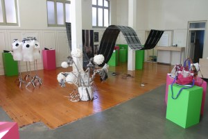
Best in Show 2010 exhibition installation Kristin D’Agostino
Investigating the relationship between the wearer and the jeweller, Kristen D’Agostino “attempts to scramble the current paradigm where one person makes and the other observes. In this case, both parties function as giver and receiver and as maker and viewer. It is an experiment in interchange and initiating relationships.” D’Agostino’s ‘relational’ forays within jewellery allow her to negotiate the boundaries of her practice both as a maker of jewellery and as a facilitator of projects such as the ‘Brooch of the Month Club’.
Nadene Carr
Applying details of her subject to a unique level of scrutiny, Jeweller Nadene Carr explores the subject of ‘the suit’. Reveling in the new discoveries uncovered by her approach, which crosses the boundary between accessory and apparel, she says “the transformation that I do want to present is its remodeling into an agent of art, quality in the materials and beauty in design. I am not concerned with garments that go in and out of fashion, or to be a passive symbol of status. It comes down to the relationship between the object and the wearer, and my questioning of the objects role on the body.”
Robyn Singh
Robyn Singh likens the process of resourcing materials for her jewellery to the feeling of having a sugar rush. It is fitting in this sense that these resources often come from such staples of our retail environment as ‘$2 shops’. “Walking away from the store” she says, “my sugar high turns into a low and guilt starts to overwhelm me. What am I going to do with all of them?” Rather than merely grabbing a bargain or indulging in retail therapy, Singh reinterprets the potential value of everyday objects, creating jewellery works which “suddenly transcend their original purpose and enter the realm of thoughtful and desirable objects. They become a unique multiple.”
Ko-Hsin Chen
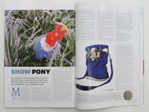
An awareness of the unnecessary accessories aimed at the blank spaces in our lives, feeds the practice of Ko-Hsin Chen, who observes; “we crave for unnecessary accessories all day every day, especially when there is a limited amount in supply.” Chen reinterprets these desires and has transferred the contemporary craving for sneakers into a range of bags fashioned from recycled retro-style shoes; perhaps drawing inspiration from previous eras when recycling was not necessarily ‘de rigeur’ but rather more of an economic and physical necessity.
Sunni Gibson
Sunni Gibson’s work questions “jewellery’s current and historic role as a signifier of status and wealth.” Gibson’s work is not focused upon upon one type of object, but represents multiple ways of viewing the subject. Treating a range of signifiers as both material and subject for jewellery, the works resulting from this interrogation are for Gibson embodiments of a thinking and making process that is engaged with our often problematic desire for luxury goods.
Matt Fanning
Textile designer Matt Fanning draws inspiration from his interests in optical effects, magic, cinema and geometry. His design practice encompasses a range of 2D and 3D elements and techniques with an emphasis upon exploring three dimensional space. Fanning observes that “directors and magicians control their audiences’ perceptions through the manipulation of space and time: my collection endeavoured to explore the manipulation of real and virtual space.”
Helen Perrett
At first glance Helen Perrett’s dog women may appear to some viewers as a statement about gender roles. Perrett on the other hand suggests a unique and empowering stance for these works when she quotes the artist Paula Rego, who said: “To be a dog woman is not necessarily to be downtrodden; that has very little to do with it … everywoman’s a dog woman, not downtrodden but powerful. To be bestial is good. It’s physical. Eating, snarling, all activities to do with sensation are positive. To picture a woman as a dog is utterly believable.”
Gwen Hudson
Gwen Hudson employs a background in fashion and textile to a series of work which combines her skills and applies them, using wet and dry felt techniques to create what she refers to as “ambiguous soft sculptural forms”. Although on one level a playful exploration, there is a serious message embedded in Hudson’s work about which she says ”these forms, representing affected mushrooms, are created around a theme of the dangers facing nature and nature’s fragility and susceptibility to manipulation and abuse.”
Raewyn Walsh
Raewyn Walsh describes her practice as moving freely “between jewellery and object and investigating the attachments we have to physical things … I am interested in the themes of collections, possession, function and purpose.” Among her investigations, Walsh’s use of the vessel, which she says represents “form and formlessness”, is a central element in her work. She is attracted both to the vessel’s utilitarian function as well as its tangible and intangible associations. Walsh intervenes with found objects, “cutting, adding new materials, and distorting shapes. I also transplant my own objects onto to them”.
Kate Butler
Jeweller Kate Butler says that her work “operates in what Julia Kristeva has called ‘women’s time.’ This is a time described as non-linear and cyclical and includes natural processes that require no agency. It is a system of ebb and flow. This notion of womens time encapsulates my process of collecting the remnants and non precious evidence of living.” Butler employs this theory using a crochet process that resembles the double helix structure of DNA. It is a fitting analogy as “each crochet stitch is a further link in the ancestral chain that I am working into … These crocheted works speak for me of complicated relationships – families meshed tightly which appear transparent on the surface but hide secrets within the mesh.”
Emma Grose
A recent excursion to Istanbul led textile designer Emma Grose to an inspired visit to a Turkish Rug shop. She writes that “the shop had a certain charm and sense of mystery about it, accompanied by a colorful shop owner, Hussein, who told wonderful tales of carpets, travel and the Turkish people.” Back in New Zealand and inspired by her travels, Grose used various photographic and digital techniques to distort light and create wonderful abstract photographic images which were then digitally printed onto fabric. The mystery and spirit of her adventures has been innovatively channeled into these works.
Corinne Lochner
Not many students would find a direct source of inspiration for their work in the building in which they undertake their study, but graphic designer Corinne Lochner did just that. Many people will know that ‘Building 1’ at Unitec is the historical site of the Oakley Hospital. She says “over the few years I studied at Unitec I was always told stories of what went on and I wanted to find out more.” Following up this interest, Lochner became inspired by “how and what went on at Oakley Hospital and having connections with people that used to work and were around when it closed as a mental hospital“. She then developed an in-depth historical project, producing and designing an intriguing new book about her findings.
Jade Muirhead
Taking inspiration from modular structures and kitset construction, Jade Muirhead’s jewellery is based on the principle of what she terms ‘kitset jewellery’. Taking on the issue of status, Muirhead says of her work; “the less you have the more you desire. Packaged in specific kits, the first kit shows what can be created if you join the second kit to the first, and then what you can have joining the third, thus leading you to want more … With play being the main factor, the wearer is the designer of their own body adornment.”
David Kaho
Graphic designer David Kaho says “being an Australian born Tongan who lives in New Zealand I have become more curious of my cultural identity”. For the final year of his design degree identity became a key influence in his design practice and saw Kaho creating a suite of work aimed at helping “understand the differences between Western and Polynesian cultural to create an understanding within myself.” The resulting publication is closely related to a poster designed to promote the. The poster is very interesting as a stand-alone project. For this Kaho designed a “contemporary-pacific heading typeface to compliment the publication. It had references to a common polynesian motif and weaving.”
Sita Main
Designer Sita Main’s ‘Furoshikability’ shelving system was “initially inspired by the decorative and fluid nature of traditional Japanese Furoshiki, the art of folding textiles to create a myriad of forms.” Main describes an interest in “the physical nature of furoshiki from how it was knotted, rolled and folded to the nature of the textiles being fluid and soft yet able to be transformed into various structures which always revert back to a simple square piece of fabric … ‘Furoshikability’ was a term coined by Korean author O’ Young Lee who wrote ‘Furoshiki Culture’ and refers to a traditional eastern way of life which favours a flexible approach over the more fitted ones of the West.”
Emma Cullen
Emma Cullen treats jewellery practice as a fluid and experimental creative process. She describes her 2009 body of work as being “made up of smaller ‘projects’, which are interconnected, particularly through the process (thought process, set of rules) they are made with and through the hand of the maker.” An initial glance at Cullen’s work suggests a selection of disparate objects. This estimation is in one sense correct however Cullen elaborates, saying that her objects “relate to experiences – each is a visual response to an investigation of my own practice, my working method, my life experience, and my person … I like to be reminded that the objects exist outside of a formal context.”
Lars Preisser
Lars Preisser recounts his upbringing In Germany where part of his family was involved with industrial looms. He recalls “I was able to see these weaving machines in action a few times. They are extremely fast and the noise they produce is so loud that you had to wear ear protection.” In exploring weaving as an artist Preisser emphasises the repetitive motions and sounds of the machine along with himself as the weaver. Integrating audio cable into the weaving, Preisser provides the listener with “an insight into the process of the weaving by echoing its own creation” and notes that “I am always aware that the computer is historically dependent on the loom. It’s the question of where something begins.”
Matt Blomeley
-
Quotidian opening
-
Best in Show featured in Metro April 2010
Best in Show 2010 opened at Objectspace on 27 March and featured in the April 2010 issue of Metro Magazine.
