Posts relating to arts projects (writing, curating, etc.)
-
Tragedies and Miracles
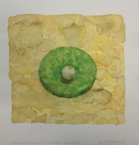
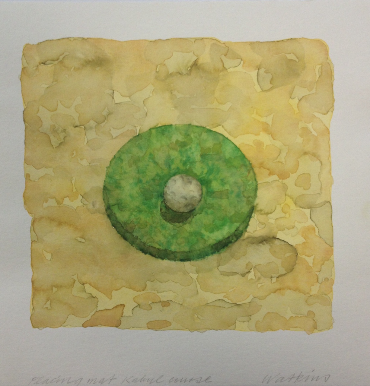
Placing Mat Kabul Course, Denys Watkins, 2013, Courtesy of the artist. Golf can best be described as an endless series of tragedies obscured by the occasional miracle. (Anonymous)
Centuries ago, the Scots borrowed an ancient game of obscure origins from the Netherlands and called it golf. Subsequently developed into the game as we know it now and of course adopted worldwide, golf is not exactly a sport inasmuch as it is actually a ’gentlepersons’ game. Once an upper crust pastime, golf became increasingly popular in the mid-twentieth century when professional competitions flourished. Fast-forward to 2013 and golf is currently facing a downturn in participation in many locations.
As is the way with a number of competitive recreational hobbies and sports, golf ball technology over the past few decades has resulted in technologically advanced equipment, designed to hit newly engineered balls further and straighter, with less effort. By many accounts, while the techniques and abilities of professional golfers have become homogenised and competition has tightened, for Joe Average player – commonly known as a ‘hacker’ – the game has not become substantially easier. This is perhaps because the recent changes to a historic game that once demanded highly nuanced skills, has resulted in courses (and the time it takes for hackers to play a round) being lengthened. This comes at a time when our personal time and attention spans are decreasing and the demand for land has exponentially increased.
Tragedies and Miracles is an art exhibition predicated around this challenging and rewarding game. The installation features a selection of works by two Albert-Eden based contemporary painters. Denys Watkins’ watercolour paintings in this installation (all 2013) comprise a symmetrical selection of six works; based variously on course golf topographies, antique equipment and greens/fairways. Adrian Jackman’s digital compositions are studies for large paintings that were completed in the 2000’s. Jackman’s works in this selection range from golf course fairways to topographical landscapes taken from ‘Google Earth’ images of irrigation patterns.
At a time of change such as we face currently, it is fitting that a central theme of these collected works is that of two artists considering humanity’s challenges with managing time, work, leisure, and our impact on the land. And why not pick one of our most challenging pastimes as a subject for these investigations?
Tragedies and Miracles is the first exhibition in a series delivered at the Albert-Eden Local Board service centre in Dominion Road. The series, entitled Corridor Space, will feature a variety of exhibitions taking place from December 2013.
Tragedies and Miracles
30 November 2013 – 12 February 2014
Curated by Matt Blomeley
Corridor Space
Albert-Eden Local Board Service Centre
135 Dominion Road, Auckland
-
Idyll

Installation image, New Zealand Steel Gallery (Image courtesy James Pinker) Idyll features a selection of works including painting, video, photography, and sculptural objects. The installations by object artists, Warwick Freeman, and, Joe Sheehan, are evocative reminders of the geology underneath us, and our various interactions with the land. Freeman’s Handles, (2009) celebrate the hand of the maker, presenting finely detailed facsimiles of tool handles that could have emerged from any grandfathers well stocked garage workshop. Sheehan’s work, The Quick and the Dead (Suite 3), (2013) meanwhile, recreates in perfect detail that ‘tool’ of 20th century leisure, the television remote control. Presented in the same manner as museum ‘taonga’ both makers works, made from New Zealand stone, are at once potent and witty social commentary.
Ruth Cleland has risen to national prominence as an artist-documenter of Hamilton’s contemporary urban sprawl. A recent series by Cleland, entitled Island, (2012) comprises a selection of photorealist drawings and painting compositions from the many newly birthed suburban traffic islands in the outskirts of Hamilton. Cleland’s ‘islands’ capture the newness of our growing nation, and perhaps also represent microcosms of the New Zealand archipelago, increasingly mapped out and repurposed for domestic and commercial purposes.
While Cleland investigates New Zealand’s contemporary urban landscape, works by Garry Currin, Landscape without Von Tempskey, (2009) and Land Transport, (2006) by Roger Mortimer, reference the nineteenth century colonial surveyor-painters, who captured visions of the nation around the time the ‘New Zealand Company’ was acquiring and on selling land. In Currin’s haunting and windswept composition, a single, oppressive row of fence posts dissects the landscape. In Mortimer’s desolate landscape, a feline prowls the foreground, while words borrowed from twenty-first century vehicle registration correspondence are deposited in a heavy-handed gothic typeface. In a large format painting by Adrian Jackman, Detail, (2009) the vast canvas combined with vigorous and skillful application of acrylic emulsion, serve as a distraction to an extent that the composition almost becomes an abstraction. This topographical landscape originated from a ‘Google Earth’ satellite image captures the patterns formed by agricultural irrigation.
A painting by Johanna Pegler, Landed, from Āwhitu, (2010) resembles a visual analogy to the ‘pastoral idyll’ poem. The scene represented could be anywhere in old England. That is, until one discovers the tree in the centre of this magnificent (New Zealand) landscape grew from a seed deposited by a settler. The New Zealand natural landscape has of course been photographed countless times. The work of Mark Adams, and, Allan McDonald, is related to this tradition. Whereas most landscape photography is centred on the great beauty of our wild landscape, the works of these significant photographers reflect upon the effects colonisation has had on our environment, and on Māori history.
In Clinton Watkins video and sound loop, Landscape Distortions, (2011) filmed footage of the New Zealand landscape becomes literally distorted by sound. Watkins’ film and its soundtrack, composed using analogue synthesisers are fed through a sound and audio processing unit. Watkins likens his process to painting. Landscape Distortions has a haunting and experiential presence; the soundtrack drowning out the visual landscape is analogous to pollution.
We have all grown up within New Zealand’s newly pastoral landscape. As depicted through the eyes of these artists, it is no surprise perhaps that their New Zealand is not ‘100% pure’. Our agriculturally dominated landscape has of course been the key to our economic development as a nation and it will always retain countless pockets of beauty. However no one could argue that our landscape has not been savoured, mined, farmed, and lamented.
Matt Blomeley, November 2013
Idyll
9 November – 21 December 2013
Curated by Matt Blomeley
The New Zealand Steel Gallery
Franklin Arts Centre, Pukekohe
Artists: Mark Adams | Ruth Cleland | Gary Currin | Warwick Freeman | Adrian Jackman | Allan McDonald | Roger Mortimer | Johanna Pegler | Joe Sheehan | Clinton Watkins
Idyll would not have been possible without the support of: Anna Miles Gallery, Matthew and Alison Bradbury, Two Rooms, Tim Melville Gallery, Melanie Roger Gallery, Ivan Anthony Gallery, Starkwhite, Whitespace Contemporary Art, and the help of Matt Henry, Tim Chapman, Eimi Tamua.
-
Refusal to Yield
Artists are often seen by the general public as people in conflict with society, and yet it is through their visions and insights that we finally come to recognise our surroundings and understand ourselves. [i]
– Jim and Mary Barr
Why do we paint and how do we define what is good in painting? As most people are aware, there are paintings about painting, paintings within paintings, paintings about things, paintings of things. Painting is old school, kicking against the pricks (or kissing up to them). It is design, a currency, representational, and it is non-objective or abstract. It can often be twee, merely pedestrian and worse, dull. So what defines good? Essentially good painting stands alone as work that has never been a fill-in for something else. It is not an aside, a ‘something that I do’ among other things.
While painting is obdurate in its refusal to yield to technology, it is not a game of refusals. At a ground level, the reason for painting’s continued importance as an artistic platform is that it is based around the physical application of artistic medium to a surface, but it is not limited to just one medium. It can engulf drawing inasmuch as it is able to pick up other pictorial technologies, from the camera lucida to printmaking and more recently digital media. That it has this magnet-like tendency in common with the dominant technology in our lives, digital media, could in fact be the strongest consideration for painting’s standing in contemporary culture, as writer Sarah Lehrer-Graiwer has observed.[ii]
If painting is essentially a parallel, a contravention or reprieve from orthodox media in the twenty first century, why is it that among visual art platforms, contemporary painting, particularly non-objective painting, both of which periodically diminish in the spotlight next to more physical and performative cousins, can still be perceived as desirable and challenging? Answering this is tricky to unpack, but essentially the challenge is that the intention behind the making of a painting is the embedment of conceptual gestures.
The reason for much of non-objective painting’s challenge and its enduring appeal is that there is no single formula for describing painting. Attempts to ascribe non-objective ‘abstract’ artistic paintings in writing are often fated to be portentous exercises wherever the public is concerned. This is often the case if the intention is to capture all of painting within a short statement, and especially, tying it up in knots with philosophical theory.
At its most pure level, painting is a humanist challenge that presents its makers (and its consumers) with a myriad of non-objective possibilities. These pathways to explore new perspectives keep it alive and universal. Painting’s challenge therefore is fluid, in that it embodies something that was determined by its maker in a moment of choice. Writer Jan Verwoert explains; “even if it’s obvious that everything possible can be represented or said, that does not mean that the possibility is within reach. First one has to know what there is to represent or say or whether there even is anything to say. The only real possibilities are those we project ourselves. In painting and in writing, too, projecting – to put it dramatically – means ‘to wrest’ something from the empty canvas or page.”[iii]
Painters and their paintings, eventually contribute to art historical representations of the era in which their best works were made. Non-objective painters in New Zealand arrived during the second half of the twentieth century, amongst the en mass acceptance of contemporary New Zealand artists. In Contemporary New Zealand Painters: Volume 1, A–M, a canonical book in the history of New Zealand art, Jim and Mary Barr wrote “we live in a country that has been slow to acknowledge its artists and even when such acknowledgement has been given, it has too often been grudging.”[iv]
Since the 1980s, the popularity of non-objective painting internationally has fluctuated, falling out and in favour while other visual art platforms and movements have flourished. The exhibition Porous Moonlight curated by Imogen Taylor, charts a small yet important selection of contemporary non-objective painters whose work has matured in the subsequent decades.
While the art of the 1970s and 1980s in New Zealand ostensibly demanded mainstream contemplation of the various roles that artists might play in our society, the artists represented in Porous Moonlight have matured in a different New Zealand. For better or worse, we are now participants in a global environment with political and neo-liberal agendas being hashed out for the first time amidst an often anesthetised and apathetic popular culture. This gets me thinking; perhaps ‘Porous Moonlight’ is an antidote?
Matt Blomeley, 11 September 2013
Porous Moonlight was an exhibition curated by Imogen Taylor at Auckland Council’s Papakura Art Gallery (7 Sep – 19 Oct 2012). The exhibition featured a selection of works by: Anoushka Akel; Dan Arps; Stella Corkery; Nicola Farquhar; Diena Georgetti; Frances Hodgkins; Michael Illingworth; Claudia Jowitt; Saskia Leek; Denys Watkins; Amber Wilson. Porous Moonlight was made possible with support from Anna Miles Gallery, Gow Langsford Gallery, Hopkinson Mossman Gallery, Jonathan Smart Gallery, Michael Lett Gallery, and The Wallace Arts Trust.
[i] Jim and Mary Barr, Contemporary New Zealand Painters: Volume 1, A–M, Alister Taylor, Martinborough, 1980. (pp7)
[ii] In an interview with North American painter, Laura Owens, Sarah Lehrer-Graiwer, suggests that ‘what may have been considered conservative takes on a newly radical aspect, now that the virtual and digital so aggressively dominant, to the point that experiencing solely as quick-click jpegs is thoroughly accepted as the norm. To insist on the importance of a physical interaction in space with an art object suddenly has the force of a challenging, transgressive demand’. Optical Drive: Sarah Lehrer-Graiwer talks with Laura Owens, Artforum, March 2013. (pp239)
[iii] Verwoert, Jan. Choosing To Choose. Parkett, No. 84, December 2008. (pp49)
[iv] Jim and Mary Barr, Contemporary New Zealand Painters: Volume 1, A–M, Alister Taylor, Martinborough, 1980. (pp7)
-
Heart of Darkness
It is the calendar industry that has, by meeting market demands, discovered a Pleistocene taste in outdoor scenes. – Dennis Dutton[1]
People have always explored their affinity with the landscape through cultivating an appreciation of art. Contemporary postcolonial New Zealand is no different. Our country faces very real issues involving the deforestation, erosion, waterway pollution and numerous native animal extinctions in our 600 million year old archipelago, which prior to the arrival of humans had developed quietly over the course of 62 million years. This situation means any awareness of the place in which we live is valuable.
The circumstances we are facing are illustrated best by the late historian Michael King who, in his seminal text The Penguin History of New Zealand, wrote: “So drastic was the impact of European settlement that one geographer was moved to note that human-sponsored modification of landscapes which had taken place over twenty centuries in Europe and four in North America had occurred in New Zealand in only one century.”[2]
Twentieth century modernist painting witnessed the birth and evolution of abstraction. New Zealand was a late-comer to this ‘party’ and when modern abstraction did arrive, the content of much art remained centred around our emerging national identity through exploring our ties to the land. Visual artists such as Colin McCahon and Ralph Hotere, for example, metaphorically and abstractly ‘peopled’ the landscape with references to and critiques of our emerging national character.
McCahon is at once an exceptional and a typical figure in Nationalist response to the ‘ultra-modern’, in simultaneously spurning and accepting it as he does, and twisting it to the national purpose. Located in the very heart of his art is the strain between a Nationalist localism and the imported forms of the ultra-modern: much of his power derives from the clash of this contradiction.[3]
The year 2012 is an interesting time for a contemporary art exhibition themed around the landscape. In twentieth century New Zealand we may have witnessed the changing terrain of international art through reproduced images, but our responses to it were played out through our unique social and physical landscape, located as we are in the South Pacific region between the tropics and the Antarctic. The development of electronic media in the late twentieth century coincided with the advancing of contemporary art, gradually erasing these borders and leading to the present time where we have caught up with international art and occupy a crossroads between traditional art practices and popular media. The fact remains, however, that despite the constantly evolving tropes of conceptual art, the landscape retains a core place in our psyche when thinking about art.
Photographer and noted environmentalist Craig Potton said “it is the nature of art and the way of nature to push us beyond the narrow realities we often become trapped in, to new or forgotten realms of pleasure.”[4] In the field of Evolutionary Psychology, as Dennis Dutton noted, the landscape seen through calendar imagery has a universal appeal to humans. Our essentially ‘Pleistocene’ taste that Dutton referred to is our evolutionary compulsion to seek the greener side of the fence. In these terms, when we look at a landscape what we are really seeing is potential, or its opposite.
Matt Blomeley, November 2012
LAND / SCAPE was an exhibition curated by Tracey Williams at Papakura Art Gallery (25 Aug – 6 Oct 2012). The exhibition featured a wide range of established, well known and emerging New Zealand artists.
[1] http://www.denisdutton.com/aesthetics_&_evolutionary_psychology.htm (accessed 5/11/12)
[2] Michael King; The Penguin History of New Zealand (Illustrated); Penguin, Auckland, 2003 (2007). pp15.
[3] Francis Pound; The Invention of New Zealand: Art & National Identity 1930 – 1970; Auckland University Press, Auckland, 2009. pp224.
[4] http://www.craigpotton.co.nz/about-craig-potton-publishing/craig-potton/ (accessed 7/11/12)
-
Latest and Greatest
The fox presents an endearing image to many people. In our home we have a fox painting by my daughter. It is an intricately realized paint-by-numbers kitset masterpiece that she worked on for many hours before presenting it to me last year. A fitting gift for one who was an avid young fan of Basil Brush back in the late 1970’s.
The fox has always appeared to me as representing our all too human desires and shortcomings. In its natural environment the fox is a striking looking, intelligent, shy and persistent creature. In our anthropomorphic terms however, the fox represents cunningness and a cheeky confidence. This is exemplified within popular culture, particularly through books, film and television where the fox, who typically wants to gain access to the chicken coop or something along those lines, is a signifier and a euphemism for base human desires.
For children of the 70’s, including artist, Bepen Bhana, the character of Basil Brush was a ubiquitous figure that exemplified a certain type of English behavior. Witty, confident and cutting a bespoke figure, he was ill at ease with true gentlemanliness by deed of an exuberant personality and to a lesser extent, his mammalian group. Basil Brush mocked the class-based society of post-colonial England in the process of entertaining a generation of children and parents.
So what does this reference to a comic character from the 60’s and 70’s have to do with luxury goods? In this exhibition, Basil Brush’s earlier Saville Row tailoring is replaced by a selection of outfits bearing facsimiles of famous yet by now extremely garish brand names. Mischievously playing with a dichotomy that we each face when publicly displaying on our person any potentially covetous label, the Basil that Bepen Bhana presents in Boom! Boom! Deluxe has become the sobriquet of an overtly fashion-label ‘branded’ person, whilst also operating as a flag bearer for these goods.
In recent decades fashion and luxury goods industries have become global. Gone are many of the original ateliers where luxury goods were conceived and manufactured. Flicking through any high profile magazine, one finds many of these gaudy labels materializing in advertisements for clothing, timepieces, bags, jewellery and other accessories. Interestingly while one may be the target audience for the glossy magazine, that does not imply you are also the target audience for the brands being advertised. The formula behind this is simple. For anyone not wealthy (and some would say distasteful) enough to afford mass-manufactured ‘luxury’ goods, it is this segments desire for the unattainable which is exactly what drives the actual sales of said goods to the upper echelon, leaving the desperate to purchase the copy or the fake.
There is another fox reference in our home. It is a DVD of Wes Anderson’s 2009 film based on Roald Dahl‘s book, ‘Fantastic Mr. Fox’. Channeled through the voice of the inimitable Nespresso Ambassador, George Clooney, Dahl’s Mr. Fox highlights how we each desire to feel fantastic in our own way in the eyes of others, and that the idealistic pursuit of status is one way to pursue this: ‘I think I have this thing where everybody has to think I’m the greatest, the quote unquote “Fantastic Mr. Fox.” And if they aren’t completely knocked out and dazzled and slightly intimidated by me, I don’t feel good about myself.’
Matt Blomeley, October 2012
Boom! Boom! Deluxe is an exhibition by Bepen Bhana, happening in November 2012 at Papakura Art Gallery
-
Super Heroes
‘Raising a child. It is not a science. It’s an art. A mysteriously delicate balance between holding tight and letting go.’ [1]
It is not until later in life that one becomes aware the toys we unconsciously connected exciting personal narratives with as children, actually held adult references of an entirely different context. Aware that the actual meaning carried in many objects goes over the heads of most kids, Chris Hargreaves’ exhibition, Super Heroes, recalls the sense of mystery in childhood, where objects and toys are connected with all manner of unexpected stories through colourful young imaginations.
There is a case to argue that children these days are often cotton-balled when compared with previous generations. Imagining oneself as being elsewhere through play and unexpectedly discovering the boundaries of your own corporeality through near misses and occasional accidents is after all a part of growing up. Hargreaves ‘Swings and Roundabouts’ (2012), which presents five glass swings at variously staggered heights, is a reminder of what adults are all too aware of when watching kids play, that up to a certain age they are full of ideas but not necessarily endowed with an understanding of cause and effect.
As with super hero characters, objects from childhood bearing war references and recreations of objects designed for violence (such as guns and military vehicle models) can through the imagination of a child, inversely inspire an interest in something more peaceful and sublime than firing bullets in malice. ‘Gold Leader’, ‘To Infinity and Beyond’, ‘Richard’s Drone’, and ‘Cumulus’ (all 2012), are works based on the Lockheed F117 Nighthawk ground attack aircraft. Infamously employed in the 1990-1991 Gulf War due to having a very small radar signature 0.025 m2, Hargreaves’ works have received imaginative surface treatments, including imagery of clouds and outer space that play on the creative potential of stealth camouflage.
Some may wonder why many children are drawn to violent iconography, and may question whether an innate capacity for violence is something we are born with. The work of Japanese artist, Yoshitomo Nara, has often courted such discussion. This is understandable in part as his manga-inspired paintings of child characters have often featured nasty expressions and carried small weapons. Nara says ‘I kind of see the children among other, bigger, bad people all around them, who are holding bigger knives’.[2] In essence, what it comes down to is that children occupy our world, for better or worse. The magic of childhood is seeing things as fantastical and even out of this world, when they are actually of our world and often more base than we would admit.
Matt Blomeley, October 2012
Super Heroes is an exhibition of Chris Hargreaves works at Bath Street Gallery, Parnell, Auckland (October 17 – November 4, 2012).
[1] http://www2.crayola.com/theartofchildhood/index.cfm (accessed October 2012.)
[2] http://www.assemblylanguage.com/reviews/Nara.html (accessed October 2012.)
-
Lost In Space
Heifer whines could be human cries Closer comes the screaming knife This beautiful creature must die A death for no reason And death for no reason is MURDER – The Smiths ‘Meat is Murder’ [i]Painting is the most fleetingly pure of design processes. The works in Denys Watkins’ latest exhibition, Lost in Space, are a case in point; abstractions loosely based upon the notion of objects or landscapes, woven together with a distinctive brand of ritualistic liminality that is associated to the artist’s impressions of the modern world. In each of these works the artist is searching for a meaningful composition through the accumulated gestures of applying paint to convey various strata of visual information.
The sense of exploration in this manner of working carries with it an element of risk in that the composition is a goal pursued until a moment of resolution becomes apparent. In these works there is no ‘endgame’ other than an indefinable, sanguine moment of skilled reflection where the maker instinctively knows to stop. The painter Albert Oehlen describes the challenge; ‘I don’t think you can really, seriously—or philosophically—try to find out what it is that a painting does to you. It’s contradictory. You can’t come to an end because, if it’s good, it’s beautiful—everything that’s good will be at the end called beautiful. But I like very much if you do things that seem to be forbidden and seem to be impossible, like a test of courage.’ [ii]
Lost in Space, the title of the exhibition taken from a classic early sci-fi television programme, is a clue to what Watkins was feeling in the studio. While Watkins’ series is conceived as abstraction, the actual works are not entirely non-objective; figurative motifs and written words both make appearances. One of these motifs is a Moa bone from Auckland Museum while another is an assortment of simplified one-dimensional machine diagrams. These references are open to interpretation, but their respective typologies within the context of each composition and their cartoon inspired forms suggest a humorous yet critical and understandably dystopian view on the clumsy ascendance of humanity.
There are other compositional cues and references scattered through the series that perhaps bear similar implications while also defying obvious purposes. For instance, in Earth House Hold; Machine of Loving Grace, and, Coney Island of the Mind (all 2012), spoked discs delineated by coloured sections located within diagrammatic compositions bring to mind Duchamp’s The Chocolate Grinder No. 2 (1914), an infamous work of abstruse purpose initially intended as a study for his equally slippery early masterpiece, The Bride Stripped Bare By Her Bachelors, Even (1915-1925).
In Watkins’ Meat Science (2012), a humanoid-dog figure sits within an inset in the pictorial composition. Appearing to be propping up a large oval of what is conceivably its metaphorical obsession with meat, the creature appears in the landscape as a burdened individual bearing a picket sign featuring the word ‘HELP’. Art theorist, Charles Harrison, wrote: ‘Landscape might be a refuge from the would-be-urbane professionalism of Conceptual Art and its derivatives. But insofar as it can be made aggressive it is no place to hide, not from the conflicts of modernity, nor from the fear of violence, nor from the power of language.’ [iii]
Ultimately Watkins works are about painting, pure and simple. He describes the process of these works creation with a concision that confirms his years of experience as an artist, ‘Its a sort of tapestry of information, weaving in events and histories, and all determined by the way the paint goes down, then embellished to construct formal visual activity.’ [iv] To employ Oehlen’s supposition, above, is it good, is it courageous? It is both.
Matt Blomeley, 11 September 2012
Lost in Space is an exhibition of Denys Watkins works at Bath Street Gallery, Parnell, Auckland (September 19 – October 13, 2012).
[i] The Smiths (Morrisey, Marr, Rourke, Joyce), Meat is Murder, Meat is Murder, Studio LP, Rough Trade, London, 1985.
[ii] Glenn O’Brien, Albert Oehlen, Interview magazine, http://www.interviewmagazine.com/art/albert-oehlen/#_ (accessed 11 September 2012)
[iii] Charles Harrison, Conceptual Art and Painting, MIT Press, London, 2001. pp122.
[iv] Quoted from an email between Watkins and the writer, September 2012.
-
APPS
‘Alas, that cyan sea is heating up and, thanks to dirty rain and human run-off carrying substances like Arm & Hammer’s Powerfully Clean Naturally Fresh Clean Burst laundry detergent, it has been a long time since the cyan of the sea has been pristine.’ (1) – Lyn HejinianThe selection of works presented in this installation, APPS, is comprised of a vocabulary of drawings that the painter, Adrian Jackman, has steadily been compiling over several years. This ‘vocabulary’ is comprised of a multitude of mass media images derived from mailbox circulars; predatory photographic and vector drawn advertising images we all know which are designed to focus upon our desire for new products; ever-cheaper tools, electronics and household goods.
Jackman treats his methodical process of collecting and re-rendering drawings of everyday objects to a rigorous yet whimsical process. He likens this pick-and-choose approach to drawing as analogous to the modernist musical theory of ‘indeterminacy of composition’. Most famously utilized by the New York School of John Cage, Morton Feldman, et al, this experimental approach to music enabled a fluidity whereby the conceptual process employed by the artist was not below the content, but rather the process itself was brought to the forefront, with meaning and structure native to the presented layers of auditory content to float freely within a fixed plane.
This process of creating a scaffold for capturing free-ranging content in a self-reflexive manner has been employed within visual art for centuries, a prominent example being the ‘mise-en abyme’ in historical and modernist painting. (2) Referring to the modernist composer, John Cage, Deleuze and Guattari observed that ‘the same could be said of the fixed visual plane: Godard, for example, effectively carries the fixed plane of cinema to this state where forms dissolve, and all that subsists are tiny variations of speed between movements in composition.’ (3)
For a painter with interests in digital rendering, formal abstraction and representational imagery, it is easy to imagine this process-centric approach to dealing with representational content as somewhat liberating. Describing his drawing process and the treatment of representational content, Jackman writes, ‘I approach drawing diagrammatically where the computer is used to trace, re scale and manipulate imagery sourced from D.I.Y catalogues and similar circular ephemera. The spectral opposites of black and white and the quality of line found within these printed resources form a formal vocabulary.’
Heavily abstracted from the advertising material in which these works imagery is sourced, Jackman’s abstractions are reflections on contemporary life, the objects we collect and, of course, the waste we are produce. Dominated as we are presently by electronic goods and cellphone and tablet ‘apps’ – and the valuable time we are squandering in gazing at them – this series is a fitting metaphor for 2012.
Matt Blomeley, 16 June 2012
APPS is a 2012 exhibition at Showhite Gallery, Auckland. For more info check out Snowhite and http://adrianjackman.com/
1. Lyn Hejinian, Colours / Cyan, Cabinet, Issue 20, Brooklyn NY, Winter 2005-2006. (pp16)
2. Francis Pound, Walters En Abyme, Gus Fisher Gallery, Auckland, 2004. (pp56) Writing about the en-abyme works of Gordon Walters, Pound could almost be describing Jackman’s APPS series when he writes, ‘we might also say that Walters’ paintings ‘en-abyme’ present representationality itself, and this ‘in’ a representation; and that they present too that which in representation allows representation to represent.’
3. Deleuze and Guattari, A Thousand Plateaus, (trans. Brian Massumi, Athlone Press, 1987), Continuum, London, 2004. (pp113)
-
Notable Serenity
In this sculptural installation by Auckland-based artist Chris Hargreaves, Notable Serenity (2012), participants are invited to visually and audibly contemplate an experimental composition that describes our geographic home in the South Pacific.
Similar to Halo, a work he completed in 2010 for the Manukau Festival of the Arts, for this new work a number of layers have been mapped into an overriding Midi score. Comprised of intricately crafted objects and sounds that taken together present an atonal composition, Notable Serenity is primarily built around four spoken word ‘roles’. These readings, borrowed from scientific texts, are defined in musical terms as: Soprano (Clouds), Alto (Resource Management Act), Tenor (Geology) and Bass (Tectonics).
The disjunctive rush of voices reading technical texts in Notable Serenity is a reminder that one is usually best to subjugate the desire to obtain facts in order to first listen. If there is a fault, it is perhaps merely that those of us who are not scientists have the easiest route to engage with this machine-like installation, being that we will not bring to this work the same accumulated technical knowledge of the installation’s auditory content as others may.
In addition to being a metaphor for the complexity of our environment – which we have continuously struggled to understand for centuries – Notable Serenity generates a sense of the machine-related anxiety that has pervaded humanity since the dawn of the Industrial Revolution. Prompting us to cultivate a careful and observant attitude, rather than searching for definitions, the sociologist, Richard Sennett, has a similarly open-minded stance to Hargreaves. Describing the enlightenment philosopher Diderot’s position at the dawning machine era, he writes:
‘The enlightened way to use a machine is to judge its powers, fashion its uses, in light of our own limits rather than the machine’s potential. We should not compete against the machine. A machine, like any model, ought to propose rather than command, and humankind should certainly walk away from command to imitate perfection. Against the claim of perfection we can assert our own individuality, which gives distinctive character to the work we do.’ (1)
While Notable Serenity may be intended – similar to Diderot’s machine – as a tool for considering our physical environment, it also serves as a reminder that it is beneficial to get lost occasionally in contemplation. Visual art and music are of course two absorbing ways to do just that. Hargreaves abstraction is not environmental science, politics nor philosophy, but it can be considered a reflection (2) of what they, individually and collectively, may represent.
Matt Blomeley, 4 June 2012
Notable Serenity is an exhibition at at Blue Oyster Gallery 19 june – 21 July 2012 . For more information visit Blue Oyster Gallery or chrishargreaves.co.nz
1. Sennett, Richard, The Craftsman, Penguin, London, 2009 (pp105,106)
2. Lütticken, Sven, Stop Making Sense, Meaning Liam Gillick (ed. Szewczyk, M et al.), MIT Press, Massachusetts, 2009 (pp40). I believe the same definition applies to Hargreaves work as Lütticken writes of Gillick: ‘That Gillick’s objects and installations reflect the becoming-design of abstraction does not, of course, mean that his work is design, merely that it reflects, and reflects on, the status of design as the current paradigm of Gestaltung through its use of post-painterly design elements and its coded implementations of a concept that can be reused and adapted to different situations.’ -
Why Milan? exhibition

Salvage stool by Tim Wigmore for Designtree I finished up at Objectspace yesterday after four and a half years as programme co-ordinator, working on many fantastic projects with tons of amazing people. Why Milan? New Zealand designers reflect was my last project in this role and it was co curated with Urbis magazine editor Nicole Stock. The exhibition runs until 4 June 2011 and features the following seven designers who have shown at Milan design week over the last seven years: Phil Cuttance, Designtree, Roderick Fry, Simon James, Punga and Smith, David Trubridge, Well Groomed Fox. My exhibition text panel follows:
Why Milan? New Zealand designers reflect is a collaborative exhibition project and magazine feature presented by Objectspace and Urbis magazine. The exhibition is an opportunity to see a selection of works that seven leading New Zealand designers have chosen to take to the prestigious Milan design week – arguably the biggest design fair in the world – over the last seven years, to showcase their work to an international audience.
Why Milan? is also an opportunity to hear the exhibitor’s assessments on the value of showing at a very high profile international event that annually attracts the design world’s elite. Collectively their reflections provide valuable insights for the local design community and other New Zealand designers setting out to position themselves within the international market. David Trubridge, a regular exhibitor at Milan design week over the last ten years, says ‘Milan is by far the best place to build reputation in the design world because it attracts all the international press as well as buyers and dealers.’
All of the exhibitors in this exhibition realise the potential value of showing their work internationally, although it is somewhat inevitable that the considerable costs involved in travelling, shipping work and exhibiting at a major commercial event create a lot of pressure. Designer Simon James says, ‘it was a huge learning curve in terms of setting up the correct business model for New Zealand exports.’
So is there is a catch? Although Milan design week is undoubtedly a great opportunity for emerging and establishing designers, some say Milan design week is becoming overrun with big budget commercial projects that threaten to swamp the smaller name designers. Partly for this reason, Trubridge says his time showing in Milan is nearly up, ‘it is very expensive and I think that now there are better ways that I can use that promotion budget … creativity is delicate precious flower that blooms in free spaces. It does not survive bombast or power games.’
What does become clear is that New Zealand designers are currently very highly regarded internationally and it is obvious that this is in part due to some of the designers featured in this exhibition. Of course, to survive and to thrive in the current market both locally and internationally, designers have to stay on the ball. Perhaps most important of all in the current economic climate is maintaining a sense of optimism and an absence of self doubt. This is suggested by Phil Cuttance, who, when asked if New Zealand can keep up with the international heavyweights says, ‘yeah, of course, we are our own worst enemies.’